Friday, December 18, 2015

Gestalt Principles


The purpose of the Gestalt Principles, which was created Max Wetheimer, Wolfgang Kohler and Kurt Koffka, is to make a design feel more complete and connected. The six principles of Gestalt Principles are similarity, continuation, closure, proximity, figure, symmetry and order.


SIX PRINCIPLES OF GESTALT PRINCIPLES:


These principles became well known because of the book Art and Visual Perception: A Psychology of the Creative Eye, which was written by Rudolf Arnheim. Arnheim explained all six principles effects as well as provided examples of the principles, but did not explain how of the were created. He finished his book by stating that these principles should be utilized to make the design look more complete.

Thursday, December 17, 2015

Semester Reflection

Over the first semester of graphic design class this year we as a class we were assigned roughly 7 projects. This is my third year in E-Communication, but this is my first year in graphic design. I decided to take on the class after my liking of my first year in yearbook. I like to work on projects such as, posters and t-shirt designs especially with loose, brush and handwritten fonts.Due to designing and completing theses projects, I have been  taught numerous things from my instructor, Mrs. Burdolski, my classmates and my myself as well.

On my Name Typography project 
I used black and white to create contrast. 
The first project, which was Name Typography, was a bit rough in the beginning because I had my sketches and ideas together,but they didn’t have enough contrast in my thumbnails. I worked hard to include contrast on this project and I attempt to carry contrast throughout my later projects. Homecoming posters was the next projected assigned; this was one of my favorite projects are I sat down and worked on it for a while. This being one of my favorite projects, I wished I had pushed this idea sooner so it could have been printed. What I liked about this Homecoming poster design was the red glow effect I put on the tree silhouettes. Working on this particular project taught me to push myself on ideas and concepts as well as look up different effects within Adobe Illustrator. My original idea for the poster was very carnival looking and it wasn’t very fitting for the event. I was inspired by tree decoration on pinterest, if I wasn’t looking around on Pinterest and behance; I wouldn’t have known about the glow effect nor have an improved concept. 

Power Puff front pocket design
The Powder Puff t-shirt design project allowed me to use fun, girly, loopy, and curly fonts that I would not normally use on a poster or t-shirt. My first swing at the project was super complex for the front pocket design and look okay large but if it were to shrink it would be a mess. I also found a paint effect on Adobe Illustrator to put on the design and type. After simplifying the design it turned out better. I know the client asked for the small front pocket design and large back design but I wish I created a just a front design because the whole front and back design is a bit redundant at Olathe Northwest. The typography project was one of the projects I went depth with because I sketched many different ideas and always led me by to the tree image so I ran with it. I scanned in my drawing and uses the pen tool and traced it. I want to go back to that project particularly because I want to pay attention to the small details. Paying attention to the small details is something I definitely learned this semester; they really do matter because they add up and affect the impact of your work. By looking at the little things it exposed me to tools I did not know about or did not know how to use such as the knife tool. I have gotten better and improved at using vector points in Adobe Illustrator. I The design is not the only thing I have to pay attention, recently on a project, I was sending to print and messed up. I did not double check to make sure the front and back of the envelope,on my branding project, were corresponding and lining up before sending it to print. And in a real life situation, that would have wasted a load of money for who or what ever company I would be working for. I really enjoyed learning about logos because I see them every day and everywhere I go. I am not necessarily content with my branding project; it could be developed more than only the logo and ice texture. 
At the end of the semester we started our personal branding project and finished and cleaned up the logo. In the start of the semester, I did not put enough time into the projects to make any of the deadlines. Part of that may have been because I have a one hour class meanwhile everyone has two. And I cannot just blame that because I knew I would only have hour as well as I need to be more driven to finish my designs. By the end of the semester I believe I improved on the time issue. Next semester, I plan to put in the time and make all the deadlines; I know it will affect my grades in a negative way, if I do not.

Sunday, September 27, 2015

Junior Powder Puff T-shirt Design

Pocket design
The scope of this project was to create a Powder Puff T-shirt for the Junior Class for the client. The client wanted the shirt to have a front pocket design and a design for the back of the shirt, that was cute and something a high school junior would enjoy wearing. I sketched ten different designs incorporating a football. Then chose one I would like to push on the computer.

My first shot at my design was a complete fail it was far too busy and wasn't appealing to the eye. I went back to the drawing board and researched front and back designs and noticed how the two designs corresponded with each other. I also noticed that the front was simpler than the large back design. I looked on how to tie the girly, curly handwritten fonts into my design to make it more feminine.  I tried to somewhat keep my original idea, and simplified the design. Continuing on the computer I moved a lot of anchor point after creating the outlines of the text "Juniors." I made the text fit within the shape.
Back design

 I tweaked plenty details like the fonts and making sure the football kept its shape. After I cleaned the design up I was happy with how it turned out.

Tuesday, May 19, 2015

Sophomore Video Final

The scope of this project was to film a news package for ONW Now, our school news station and applied the skill we have learned through out the school year. First I had to find someone who has an interesting story as well as being able to tell their story. My first idea didn’t work out due to them not wanting to tell their story, so I found state winner of high school gymnastics and newcomer diver who is qualified for state, Jessie Payne to interview and film at one of her diving practices.

 Then after filming B-roll at the practice, I wrote my twenty-one questions from a template we all were given earlier this year. Interviewed Jessie the next day and upload all my footage, favorite the clips I would like to use. Later in class, I arrange the B-roll and sound bytes to match. Quickly wrote my voice over script around the things I had planned (like the Audio/Podcast Story Jessie Blom).
Time managing went much better this project compared to previous project earlier in this year like the music video from November.


 Something I would do differently if I were to do this again would not stress or freak out due to my perfectionism and understand that we are sophomores and not everything will be perfect. :) Although I think that’s why it turned out the way it did! I loved working with the Broadcast group in our class, it was a great group of people that worked well as a team. I am not only interested to see where this will lead me in the future but as a team as well!! 

Animation Final

For our final project our group, Jacquelynn, Wyatt and I worked together to finish our project. Wyatt came up the idea of the soccer scenario, then made story boards the next day.  Our 'goal' (get because of soccer) was to complete this illusion that this kid was imagining that he was a pro soccer player at  huge stadium but in reality he is at school kicking a soccer ball. My role I played in the group was that I filmed the video portion. When we filmed I made sure to measure the position of the camera like, the height of the tripod, and how far away the subject was to the camera. Jacquelynn made the soccer ball in the Maya program. Wyatt worked on Animation aspect through After Effects like editing the video together and keying the green screen.  In the end, our project turned out well. The only thing that I would change if I would do it again, I would like to have contributed more to the group! Even though, this class isn't my strongest skill to do, I would have liked to have had a larger role or part for the project.


1. 
2.

Green Screen 1, 2, 3, 4:

 1.Film on the green screen with the exact measurement from the previous scene.2. Use the color magenta color, to check it any green in shown3.Find your background and key in4.Add in background and see the magic of the green screen

3.
4.

Monday, February 9, 2015

Maya Tools

Salt shaker:

To loft
something you must select
 everything you're wanting t
hen click this button. 
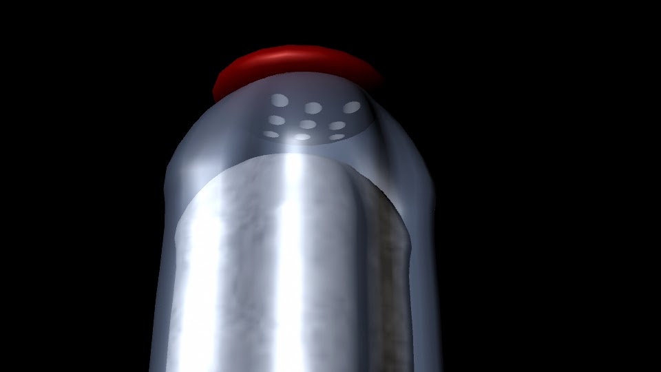
I made this dinner salt shaker by shaping the base of the shaker. Then made a skeleton of the body of the shaker. Later used the lofting tool to make the body of the shaker and colored it blue with a transparency. Next I made the cap of the salt shaker and then colored in a red blinn material. Then made the holes of the cap by making the small cylinders and placing them in the lid then select the cap and then all the cylinders then going Mesh>booleans>difference.The last step in the salt and you make a shape then bump map the salt texture on the shape. 


Cups:

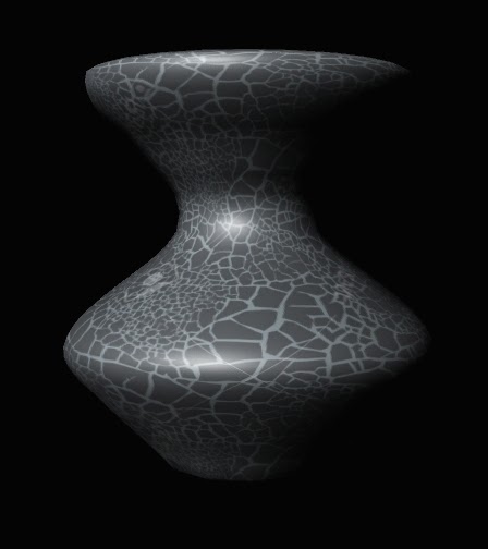
This project was the introduction to NURBS. NURBS is the Non-Uniforn Rational basis spline. First sat my folder up for the new project
To finish off the cup
I used this revolve tool. 
in my sever folder. Then started working with the Curve tool and started shaping half of the glass along the grid. Once I had the figure shaped how I would like it. I used the revolve tool, which finished the other half and made it final shaped of the glass. I repeated this but with I different outline with the curve tool to make the vase. I later found seamless texture online to use for the glass and vase. I got the texture in the glass by assigning them as a new material and importing the file. Lastly I set up my lights in order to showcase them the best way possible.


Bounce:

Before editing anything we went and dropped each type of ball we were going to editing and recorded it. Then watch the three videos and collect data of the frames of when it the balls hit floor and when the ball reaches it's highest peak. Next make a sphere and move to according to the data. Press the letter "S" when you are wanting to adding a keyframe. Then do this three times for the tennis, bowling and golfball. Then assigned them a seamless texture.